Visual Identity for an art supply store
The objective of this project was to create a comprehensive branding guide that clearly defines the visual identity and messaging for Flow, an art supplies store. The objective is to establish Flow as a welcoming and inspiring destination for artists of all levels, fostering a community around creative expression. It also emphasizes the client's goals of building a strong brand presence and fostering a community.
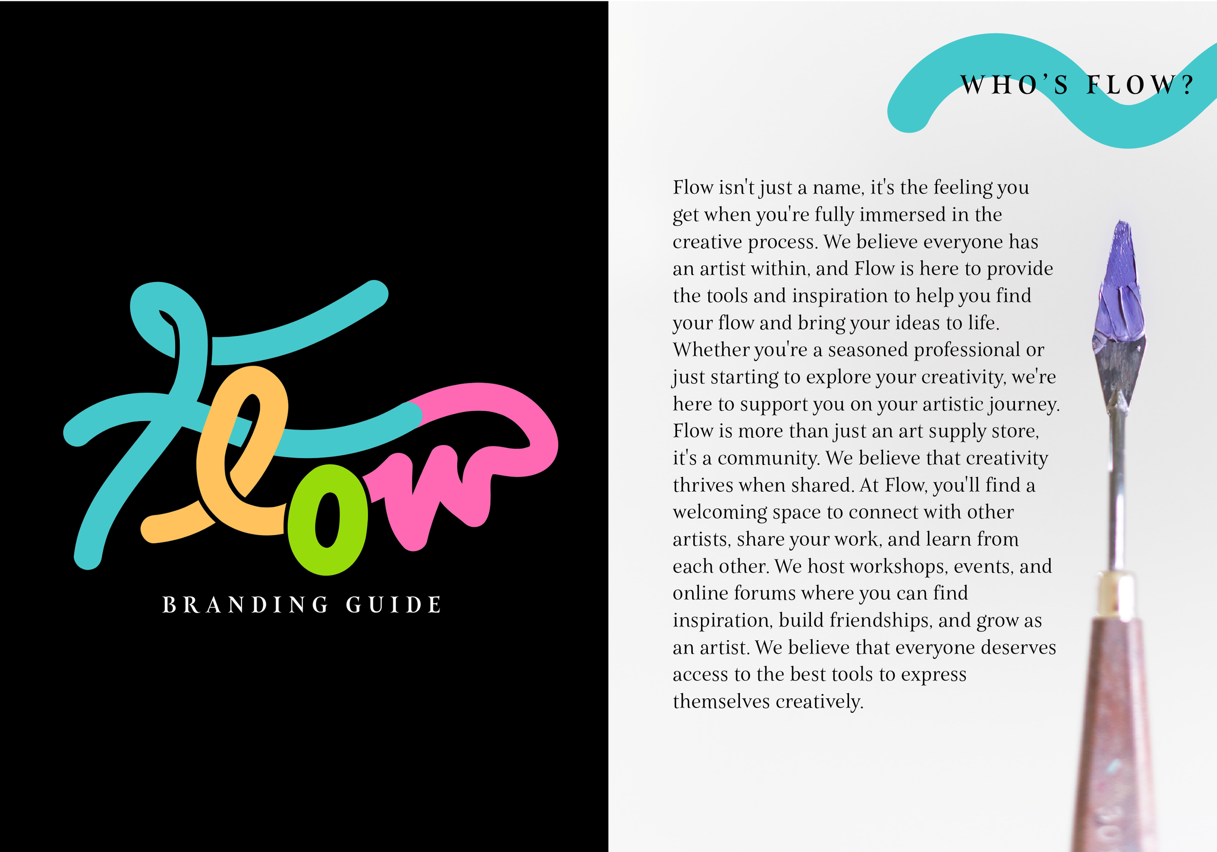
To capture the essence of Flow, I focused on creating a brand identity that is both inspiring and accessible. The logo features a dynamic colors, symbolizing the fluidity and creativity associated with artistic expression. I selected a modern serif font for body text, creating a balance between artistic flair and readability. The brand color palette utilizes a range of bold and vibrant hues that reflect the energy and enthusiasm of artistic exploration.
To illustrate the brand identity in action, I created a sample poster promoting an upcoming sale at Flow. This poster exemplifies how the logo, typography, and color palette can be combined to create eye-catching marketing materials that resonate with our target audience. This branding guide serves as a foundation for building a consistent and engaging brand presence across all platforms. By adhering to these guidelines, we can ensure that Flow is instantly recognizable and delivers a positive and inspiring experience for every customer who interacts with our brand.